About the company
ChangeMyWorldNow.com is a New York-based children's startup dedicated to producing high-quality content and interactive games for kids (ages 6-14). It is a fun and safe social activations platform for the next generation.
As a Lead UX/UI Designer, I helped fix:
1. Onboarding
2. User Retention
3. Site and overall platform accessibility
4. Branding and digital art direction refresh
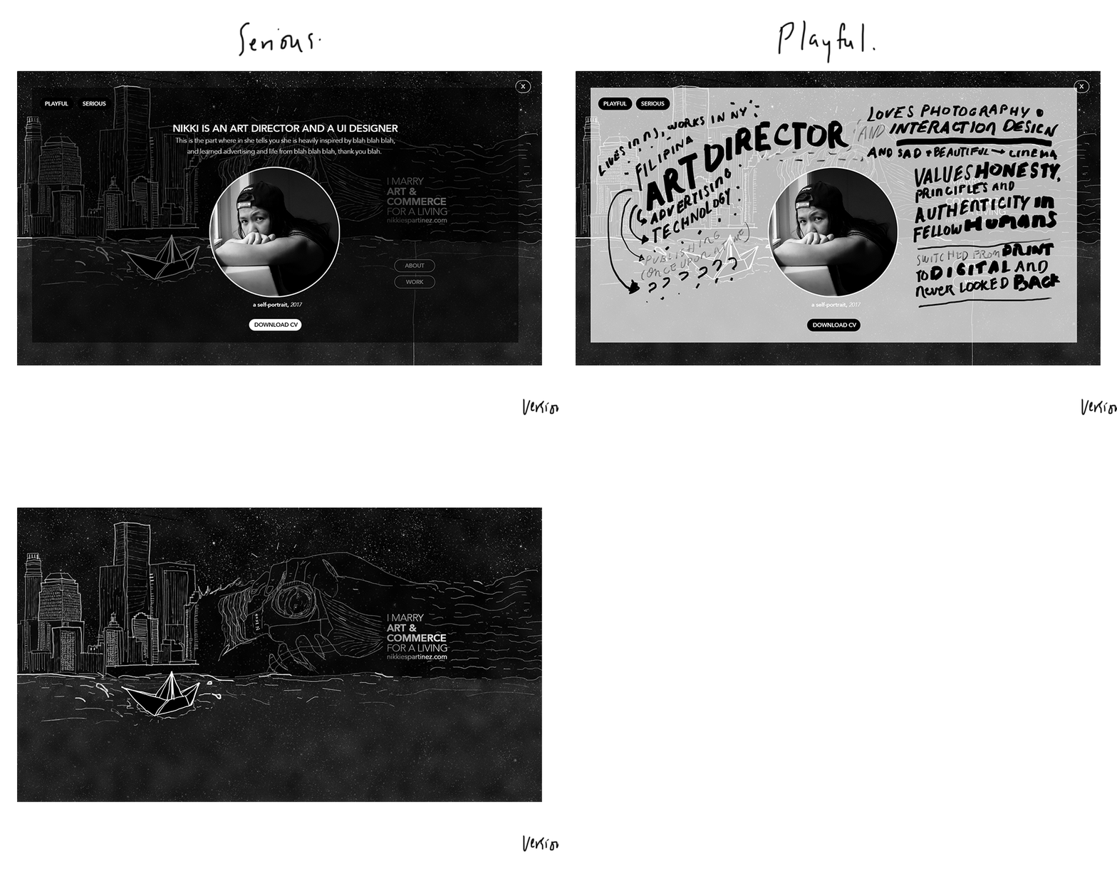
These are the hero images, and mood boards I've created for the site branding. I likened the treatment of the visuals below to how it feels like working with and at ChangeMyWorldNow.com: warm, organic, genuine and loving environment that highly values the beauty of diversity, individuality, kindness and a culture of growth and productivity. Situated in the heart of Midtown Manhattan where everything's fast-paced and people are just generally caught up doing their own thing, it's been an absolute pleasure to encounter this team and to believe alongside them that we can change the world, one kid at a time. It was worth to try.
This is a visual treatment study for the website's headers. I wanted to create a fun, and dynamic fusion environment for the site that would reflect what the content is. I think vector illustrations work best when paired with photos, and quirky imagery.
Artifacts
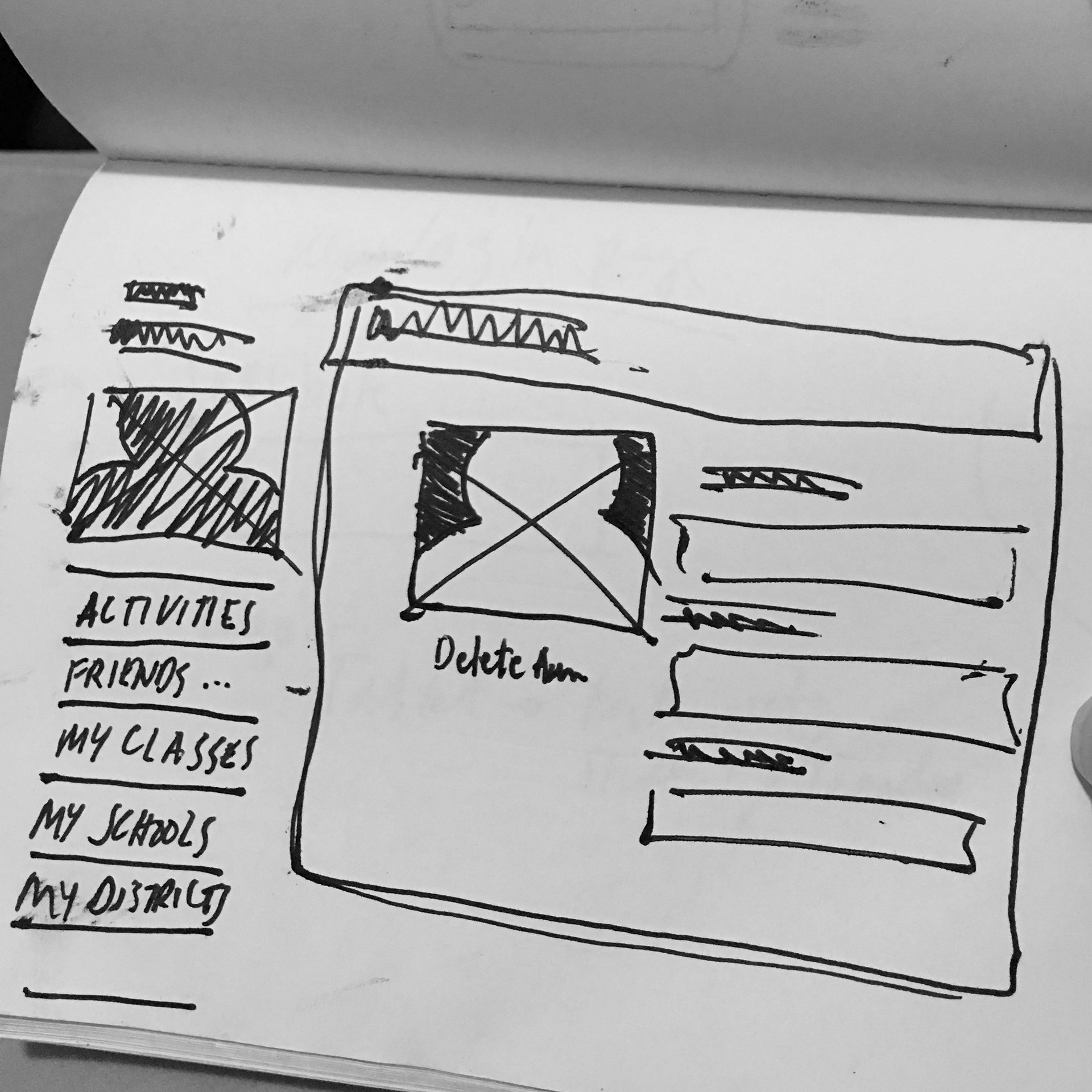
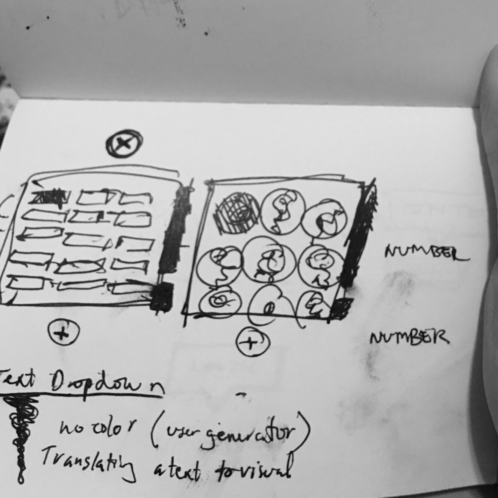
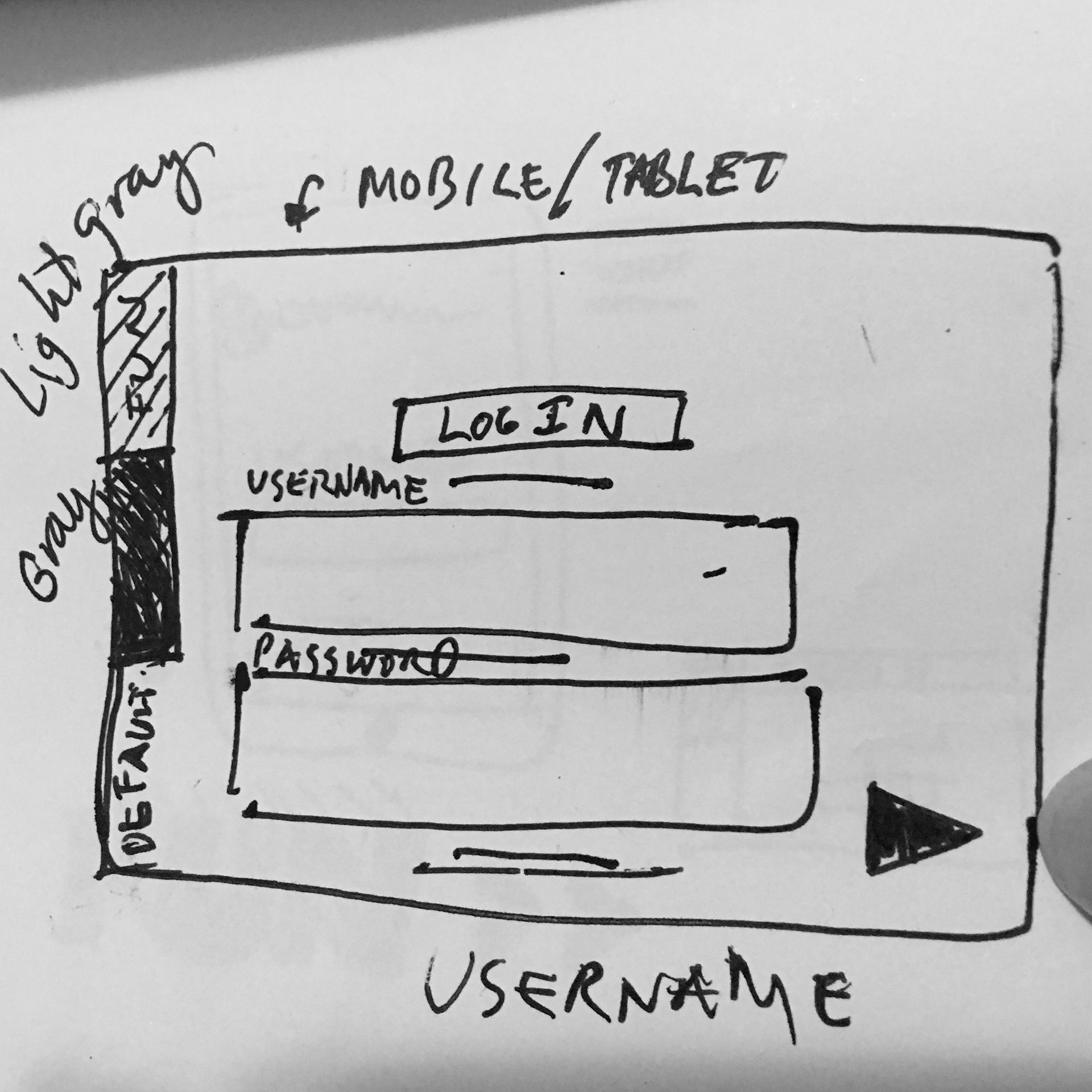
Early sketches and low-fidelity wireframes created on paper for various features, and potential solutions to the company-wide issues such as usability, functionality gloat and sub-part quality of existing visual design and branding. We needed to take this to the next level. These sketches were born from whiteboarding sessions with the company's high-level stakeholders (VP of product, front and backend developers, fellow designers).
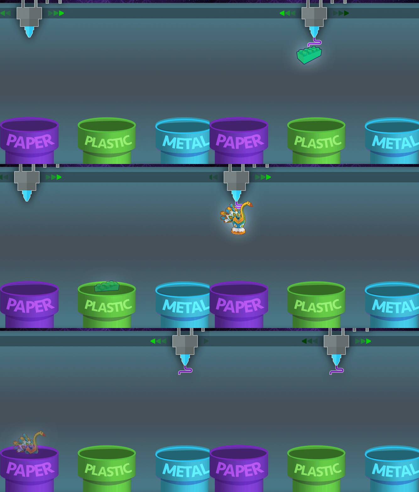
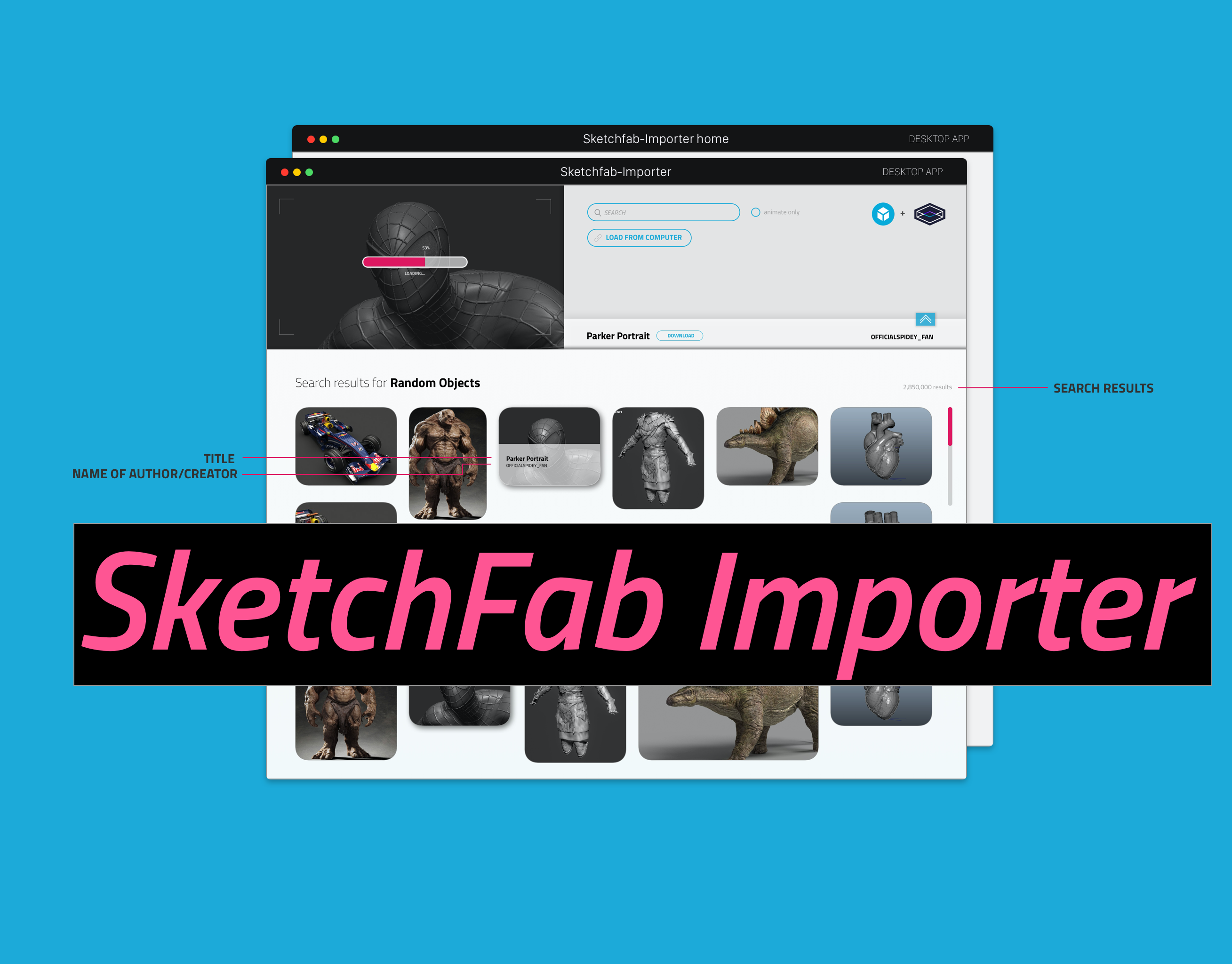
Before we had this feature, we were having issues with naming. We needed a tool that would essentially help users create a unique username they can change anytime, from any device. Its "gamifying" a very simple task, and creating a pleasant experience for our users while they are at it.
Another lingering issue we found for the site it accessibility. Based on research, we found out that a majority of our adult users (Teachers, parents, school administrators) are having a difficulty with the site's functionalities and in turn, they cannot use to the site to its full potential. In hindsight, it may have a lot to do with the Information Architecture at that time. As a UI/UX designer, I proposed a solution: a microsite visible on the homepage that would essentially help these adult users not just navigate the site easily, but to explore what exactly are in the website and what it offers to their students. It's selling the value of the content, and providing current and potential users a glimpse of the things and how they could be useful in a classroom or home setting. It also serves as a media kit/a library for the company and can evolve to something a lot more, if permitted.